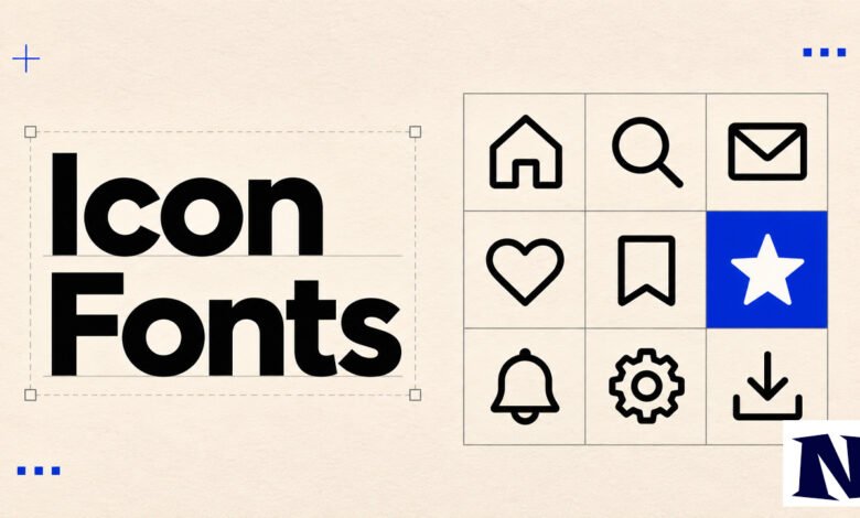
Icon fonts package scalable symbols into a single font file so websites can display icons the same way they display text. Developers once relied on them heavily because they solved the problem of blurry, hard-to-style PNG icons on high-resolution screens. Today the technique still appears on many sites, even as SVG icons have become the preferred choice for new projects.
This guide covers what icon fonts are, how they developed, the main libraries still in use, their practical strengths and limits, and clear advice on when they make sense.
What Are Icon Fonts?
An icon font is a typeface whose glyphs are pictograms instead of letters and numbers. A single file (usually in WOFF or WOFF2 format) can hold dozens or hundreds of icons. Once the browser loads the font through CSS, any icon can be shown by applying a class name or a Unicode character to an HTML element.
Because the icons are font glyphs, ordinary CSS properties control them. You can change size with font-size, color with color, and alignment with the same techniques used for text. The result scales cleanly on any screen density and loads with one HTTP request for the whole set.
This approach differs from embedding individual images. A traditional sprite sheet or collection of PNGs requires separate files or careful coordinate calculations. An icon font treats every symbol as a character, which simplifies both maintenance and styling.
A Short History of Icon Fonts
Symbol fonts have existed for decades. Desktop systems shipped with sets such as Wingdings and Webdings that let designers insert arrows, bullets, and ornaments as typed characters. On the web the idea remained limited until browsers widely supported the CSS @font-face rule around 2011.
Once custom fonts could be loaded reliably, designers realized the same technique could deliver interface icons. Early experiments appeared in 2011 and 2012. The approach gained rapid traction because full SVG support across browsers was still incomplete.
Dave Gandy released Font Awesome in March 2012, originally as a companion to Twitter Bootstrap. The first version contained about 140 icons. It solved the common frustration of managing colored PNG sprites and quickly became the default choice for many developers. Other libraries and custom generators followed, and icon fonts remained the standard method for vector icons for several years.
How Icon Fonts Work
The process starts with a font file that maps each icon to a Unicode code point. A CSS stylesheet then declares the font with @font-face and defines classes or pseudo-elements that display the desired glyph.
A typical markup pattern looks like an empty element with a class:
An element receives a class such as “icon-home.” The stylesheet sets the font-family to the icon font and uses a ::before pseudo-element to insert the matching Unicode character. Color and size then cascade like ordinary text.
Some libraries also support ligatures, so typing a word such as “home” can produce the home icon when the correct font is applied. This can improve readability in the source code, though it requires careful setup.
Because the icons are text, they inherit many text-rendering behaviors. On Windows, ClearType or grayscale antialiasing can sometimes make thin icons appear slightly blurry or uneven at small sizes. Positioning is also constrained by the font’s baseline and line-height metrics.
Popular Icon Font Libraries
Font Awesome remains the most widely recognized library. Its free tier includes more than 2,000 icons, with a much larger Pro collection available by subscription. It offers solid, regular, and brand styles, plus extensive documentation and CDN hosting. Many sites still load it through a single CSS or JavaScript include.
Material Icons, published by Google, provide a large set of symbols designed to match Material Design guidelines. They are available as a web font as well as SVG and PNG formats. The set emphasizes consistency across Android and web interfaces.
Other options include Bootstrap Icons, which integrate cleanly with the Bootstrap framework, and various open-source collections that can be subsetted. Tools such as Fontello and IcoMoon let developers pick only the icons they need from multiple source libraries and generate a smaller custom font.
These generators reduce file size by excluding unused glyphs. A project that needs only twenty icons can download a font a fraction of the size of a full library.
Advantages of Using Icon Fonts
One of the strongest practical benefits is simplicity. Adding an icon often requires nothing more than a class name and a link to a stylesheet. Color, size, and basic hover effects are controlled with the same CSS already used for typography. Teams that already manage web fonts find the workflow familiar.
A single cached font file can serve every icon on a site. After the first page load, subsequent pages reuse the font from the browser cache. For pages that display many simple, monochrome icons, this can be efficient.
Compatibility is broad. Icon fonts worked in older browsers, including versions of Internet Explorer that lacked solid SVG support. They also scale without quality loss on high-DPI displays, which solved a real problem when retina screens first became common.
Customization within the limits of text is straightforward. Changing an icon from black to brand blue, or from 16 pixels to 24 pixels, takes one or two declarations. No image editor is required for routine adjustments.
Drawbacks of Icon Fonts
Icon fonts are limited to a single color. Multi-color icons or gradients require workarounds such as stacking multiple glyphs, which increases complexity. Individual strokes inside an icon cannot be styled separately.
Accessibility can suffer if the implementation is careless. Screen readers may announce the underlying Unicode character (for example, reading a private-use-area code as random text) or skip the icon entirely. Proper ARIA labels or visually hidden text are needed to convey meaning.
Loading behavior creates another issue. Until the font file arrives, the browser may display a missing-glyph box or a fallback character. This flash of incorrect content is noticeable on slower connections. Font files also contain every glyph in the set, so unused icons still consume bandwidth unless the developer creates a custom subset.
Rendering quality varies by operating system and browser. Text antialiasing algorithms optimized for letters do not always produce the sharpest results for geometric icons, especially at small sizes on Windows.
Icon Fonts Compared to SVG Icons
SVG icons are individual vector graphics. They can be inlined in HTML, referenced as external files, or combined into a sprite. Each SVG supports multiple colors, gradients, and independent animation of paths. Accessibility is usually stronger because title and aria-label attributes can be added directly.
File-size comparisons depend on usage. A large icon font may be smaller than dozens of separate SVG files when many icons appear on one page, but a well-optimized set of SVGs or a sprite often wins when only a few icons are needed. Modern build tools can also tree-shake unused SVG components.
SVG support is now universal in current browsers, removing the compatibility advantage that once favored icon fonts. Most major libraries, including Font Awesome and Material Icons, now offer SVG packages alongside their font versions.
For new projects the practical recommendation is usually SVG. It provides better control, clearer accessibility, and more predictable rendering. Icon fonts remain reasonable for legacy codebases, simple monochrome sets, or teams that prioritize the absolute minimum markup.
How to Add Icon Fonts to a Website
The most common method is to include a CSS file from a CDN or from a self-hosted copy. Font Awesome, for example, supplies a single stylesheet link that loads the font and the necessary class definitions. After that, an element with the appropriate class displays the icon.
Self-hosting involves downloading the font files and the accompanying CSS, then serving them from the same domain. This avoids third-party requests and gives full control over caching headers. A custom subset created with Fontello or IcoMoon is often the smallest option.
Some libraries also provide JavaScript kits that load icons on demand. These can reduce initial payload when only a few icons appear above the fold, though they introduce a small script dependency.
In all cases the font should be declared with font-display: swap or a similar strategy so text remains visible while the icon font loads. Testing across browsers and devices remains important because antialiasing differences can affect visual weight.
Building Custom Icon Fonts
When a project needs a unique set of icons, designers typically export the symbols as SVG files from a vector editor. These files are then uploaded to a generator such as IcoMoon or Fontello. The tool assigns Unicode points, produces the font files, and generates the matching CSS.
The resulting package contains only the selected icons, which keeps the file size small. Designers can adjust metrics such as baseline alignment inside the generator before download. Once the files are on the server, the same class-based usage pattern applies.
Custom fonts work best when the icon set is stable. Adding or removing glyphs later requires regenerating and redeploying the font, which can be more cumbersome than updating individual SVG files.
Accessibility with Icon Fonts
Meaningful icons need text alternatives. A common pattern places the icon on a decorative element and supplies a visually hidden label or an aria-label on the parent. Purely decorative icons should be marked with aria-hidden=”true” so assistive technology ignores them.
Private-use Unicode characters should not be relied upon for meaning. Screen readers do not reliably interpret them. Testing with actual assistive technology, rather than visual inspection alone, reveals whether the icons convey the intended information.
High contrast and sufficient size also matter. Because the icons are text, they respond to user font-size preferences, which can be an advantage if the surrounding layout accommodates the change.
Should You Still Use Icon Fonts?
For brand-new sites the clearer path is SVG. The format offers superior flexibility, more reliable accessibility, and no risk of missing-glyph flashes. Build tools and component libraries have made SVG integration straightforward in React, Vue, and similar frameworks.
Existing projects that already depend on a large icon font can continue without immediate urgency. Migrating every icon at once is rarely necessary. A gradual replacement of the most important or multi-color icons with SVGs is a practical middle step.
Icon fonts still serve simple cases well: a small set of monochrome symbols, a content-management system that already ships with the font, or a need to support very old browsers. In those situations the technique remains functional and familiar.
The choice ultimately depends on the number of icons, the need for color or animation, accessibility requirements, and the team’s existing workflow. Both approaches can produce clean results when implemented carefully.
Conclusion
Icon fonts solved a real problem in the early years of responsive, high-resolution web design by turning symbols into scalable, CSS-styled characters. Libraries such as Font Awesome made the method easy to adopt, and the technique remains visible across the web. At the same time, full browser support for SVG and improved tooling have shifted the default recommendation toward SVG icons for most new work.
Understanding both options helps teams make informed decisions rather than following a single rule. When an icon set is simple, monochrome, and already integrated, an icon font can still be efficient. When color, accessibility, or long-term maintainability matter more, SVG is the stronger choice. The underlying goal remains the same: clear, consistent icons that load quickly and work for every user.
Frequently Asked Questions
What is the difference between an icon font and a regular web font?
A regular web font contains letters, numbers, and punctuation. An icon font contains pictograms mapped to Unicode positions. Both are loaded the same way with @font-face, but the icon font is used only for symbols rather than readable text.
Are icon fonts still used in 2026?
Yes. Many existing websites continue to load Font Awesome or similar libraries. New projects more often start with SVG icons, yet icon fonts have not disappeared from the broader web.
Can I use only some icons from a large library?
Yes. Generators such as Fontello and IcoMoon let you select individual glyphs and download a custom font that contains only those icons. This reduces file size compared with loading an entire library.
Do icon fonts work with screen readers?
They can, but only with extra markup. Without aria-hidden or proper labels, screen readers may announce meaningless characters or skip the icon. SVG icons generally make accessible labeling simpler.
Is it hard to switch from icon fonts to SVG?
The difficulty depends on how many icons are in use. Replacing a handful of icons is straightforward. Large codebases may require a phased approach, updating templates and styles over time while both systems coexist temporarily.
See more amazing Information visit Novira Magazine